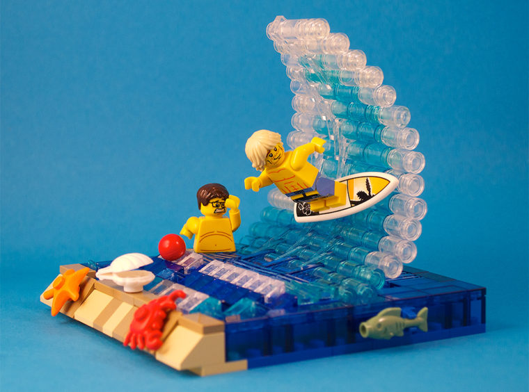
 If I gave you a pile of rectangular bricks, what would you build? Many would build a wall. My 3-year-old would certainly build a tower. People expect a square wall from square bricks, but they are more impressed by a curved arch from those chunks of masonry.
Masterfully demonstrating the “wave technique” in this surfing scene, Sylvain Amacher (captainsmog), turns the blockiness of LEGO into a sleek action scene.
A graphic designer from Switzerland, Sylvain knows how to please the eye.
Pertinence and Restraint
As with this vignette, a designer can enhance a creation using accessories, but this must be done tastefully. Sylvain says doing so is a matter of “pertinence and restraint.”

– Sylvian designs T-shirts which are available at Redbubble.com –
Putting the right accessories in the right place creates an engaging scene, but, Sylvian warns, just be careful to avoid saturating the scene with too much detail.
3 Graphic Design Principles
Sylvian leaves us with 3 graphic design principles.
- Remain as “sober” (not too many details or colors) as possible to keep the viewer’s eye focused on what is important.
- If you build a series of models that have a common theme, maintain what I call a “graphic line.” In other words, use a color scheme or carry a common part through all of the models.
- Expand your knowledge of photography to make the best use of light, focus, and framing.
Now get out those bricks famous for their round pegs and square holes, and build something you didn’t know you could.

Please note: I reserve the right to delete comments that are offensive or off-topic.